

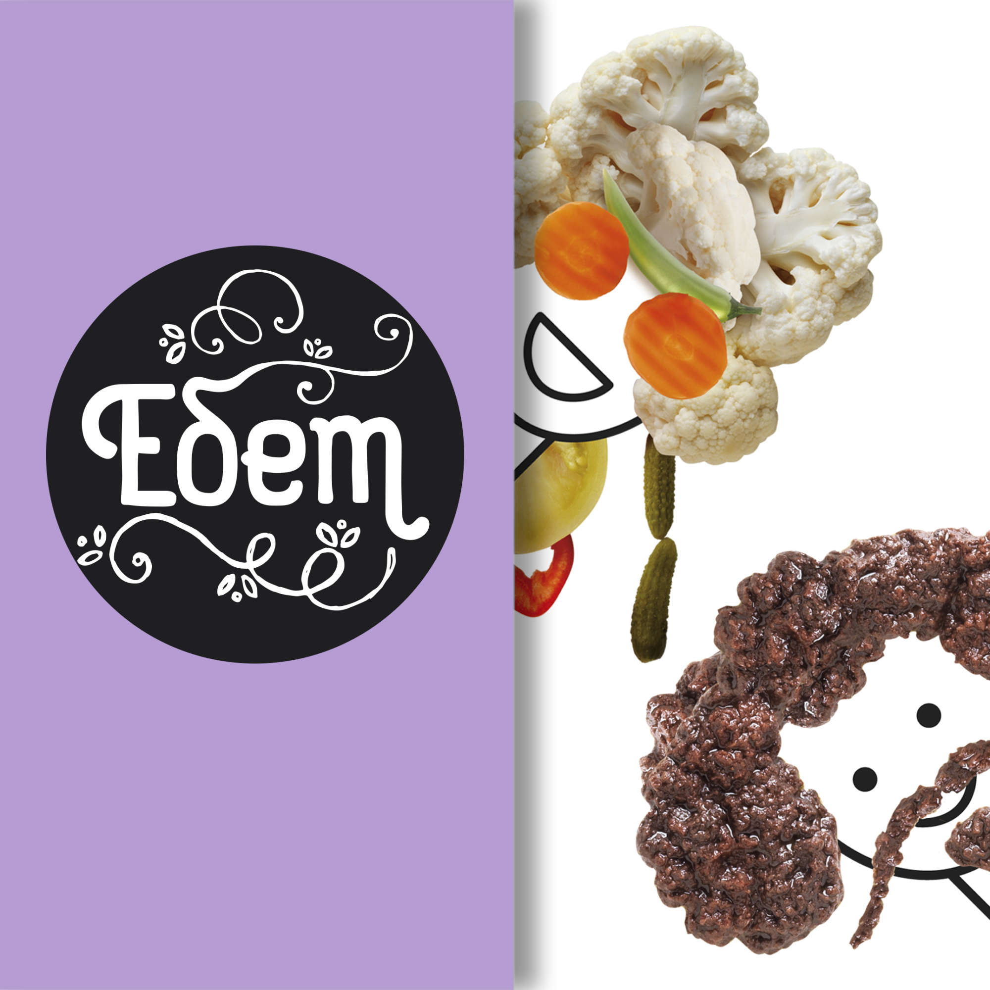
Eδem
The client has asked for complete re-branding of the food products. The brief was to find a new concept for the entire range reflecting the values and the quality of the brand and if necessary, to find also a new brand name.
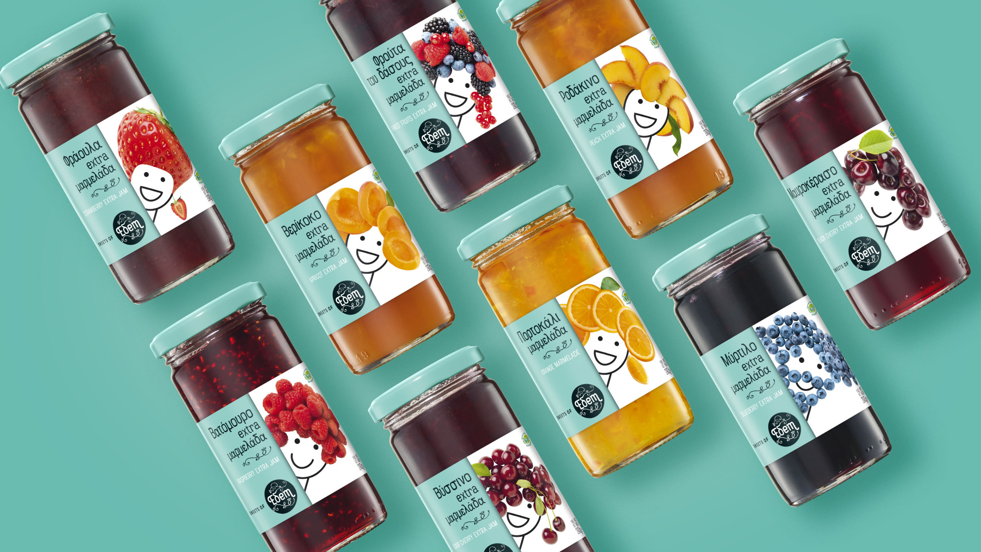
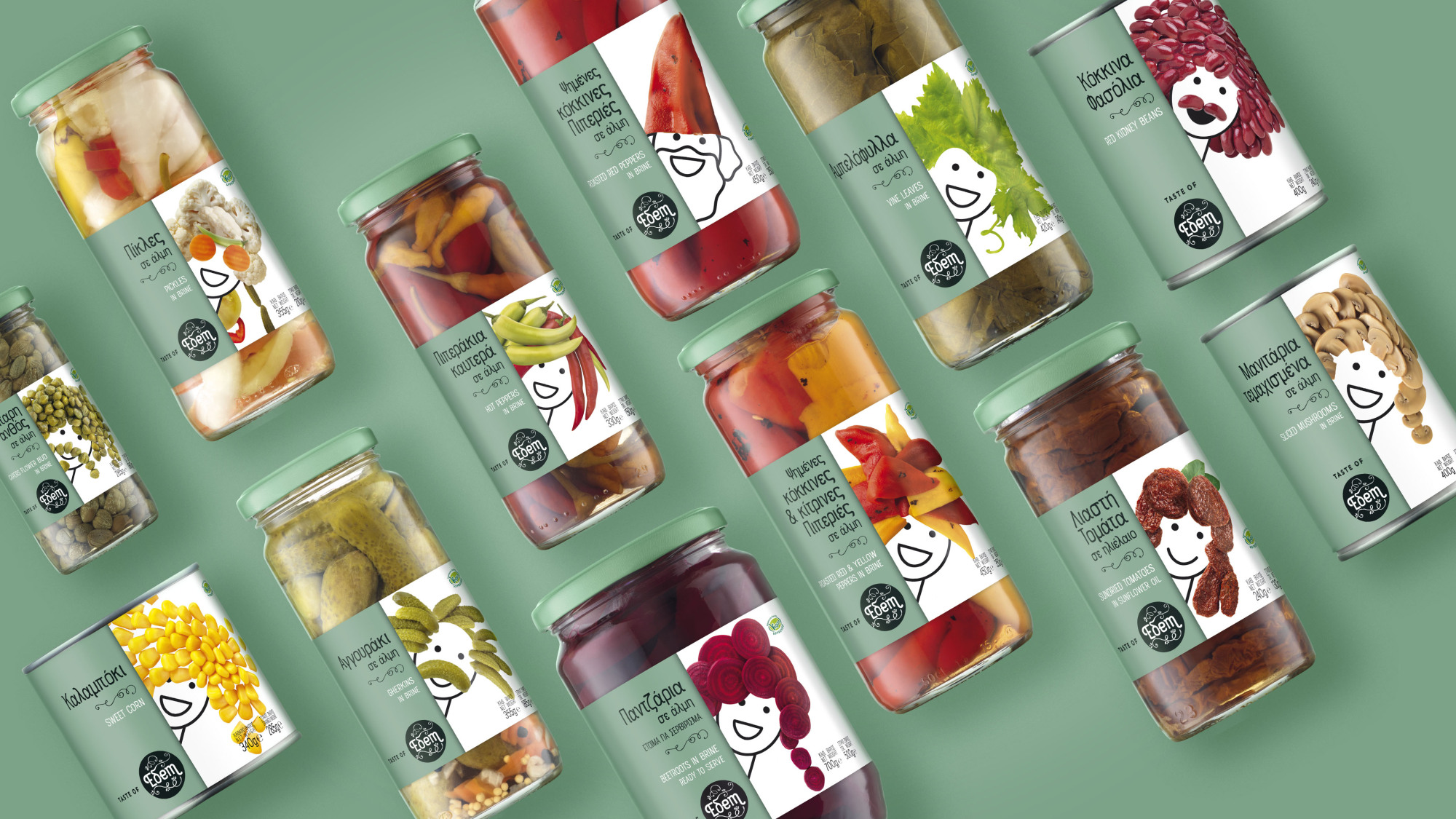
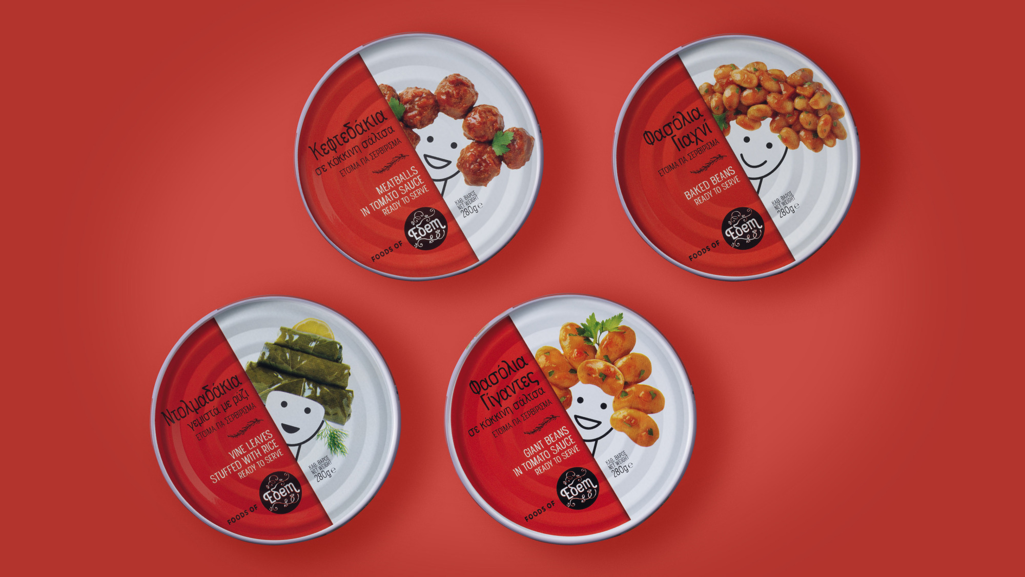
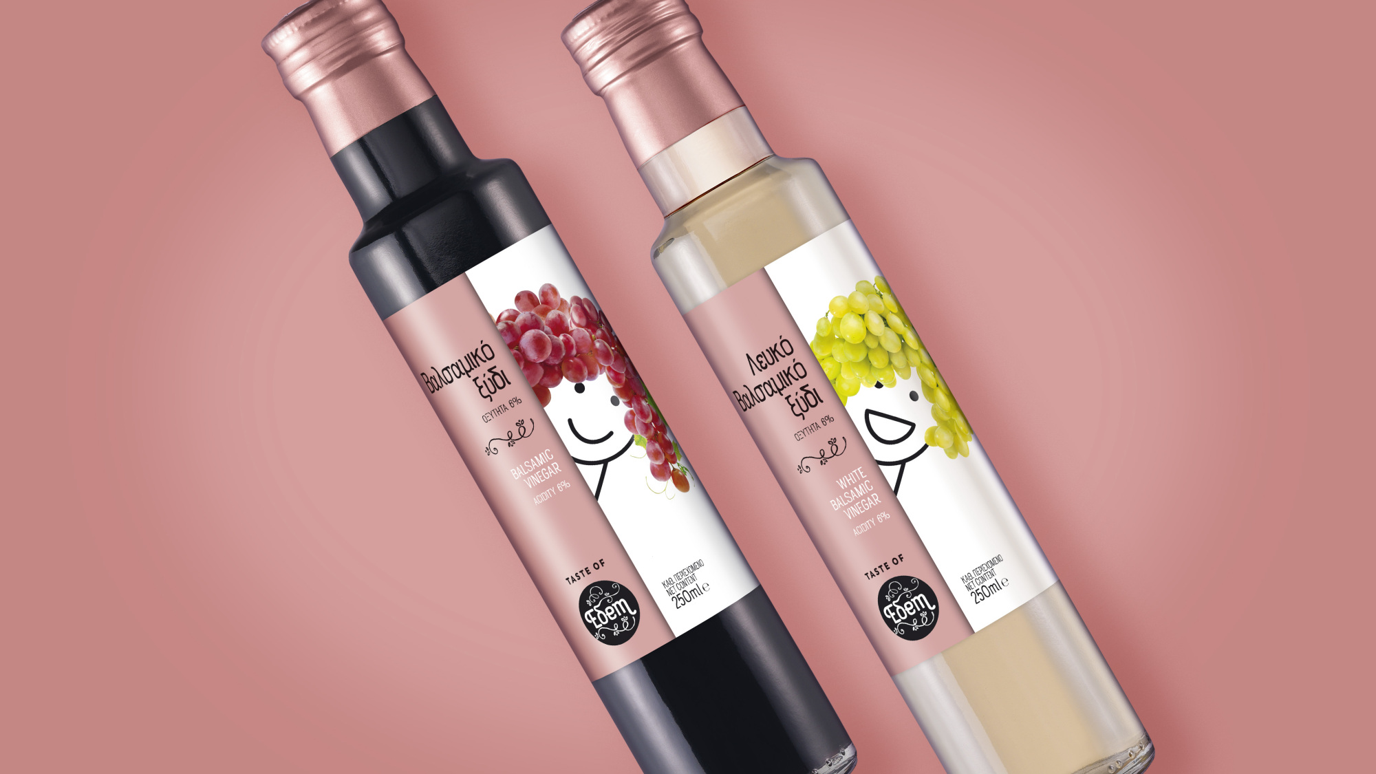
Having in mind to create a series with "playful" images to involve the consumer into a new experience, we started playing with the food. The core concept was to find a common place for all these products (generally agricultural). An imaginary, ideal, ever-growing place, ensuring quality and care. We called this place "Eδem". It is an island with many places and gardens where each product is cultivated and prepared.
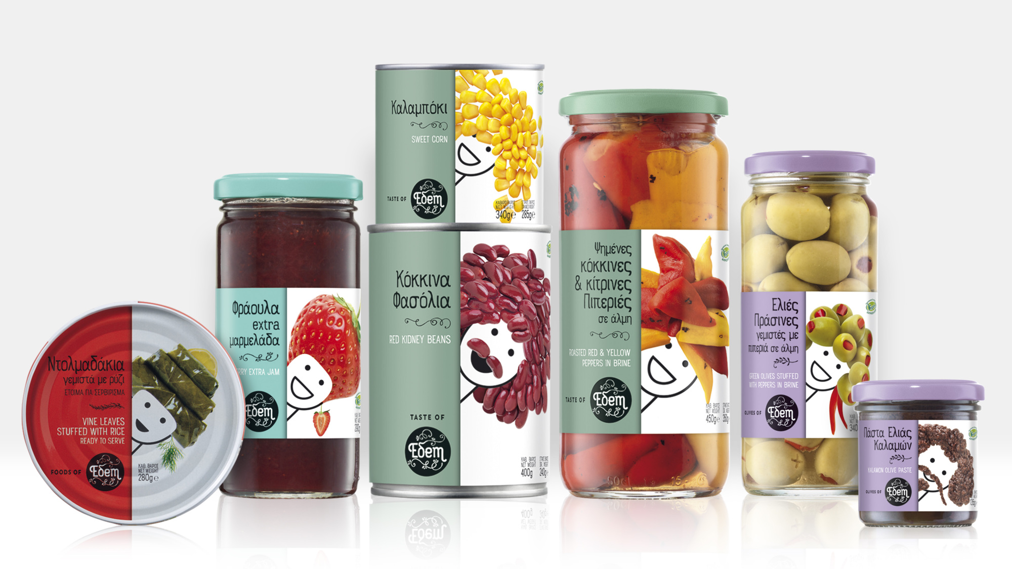
All products are grouped in categories (olives, pickled products, jams & preserved fruits in syrup, canned food and condiments) with a color code per group.
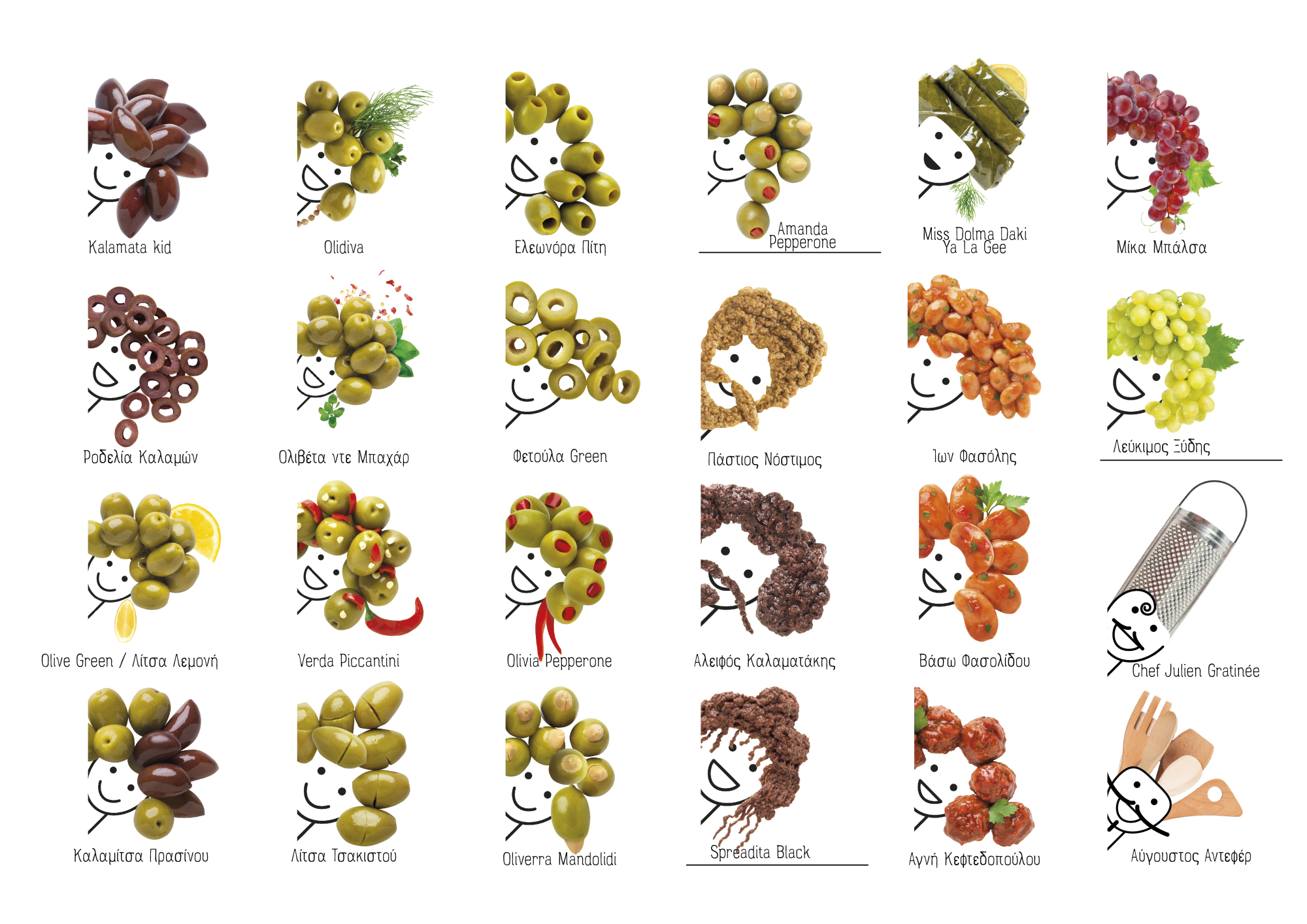
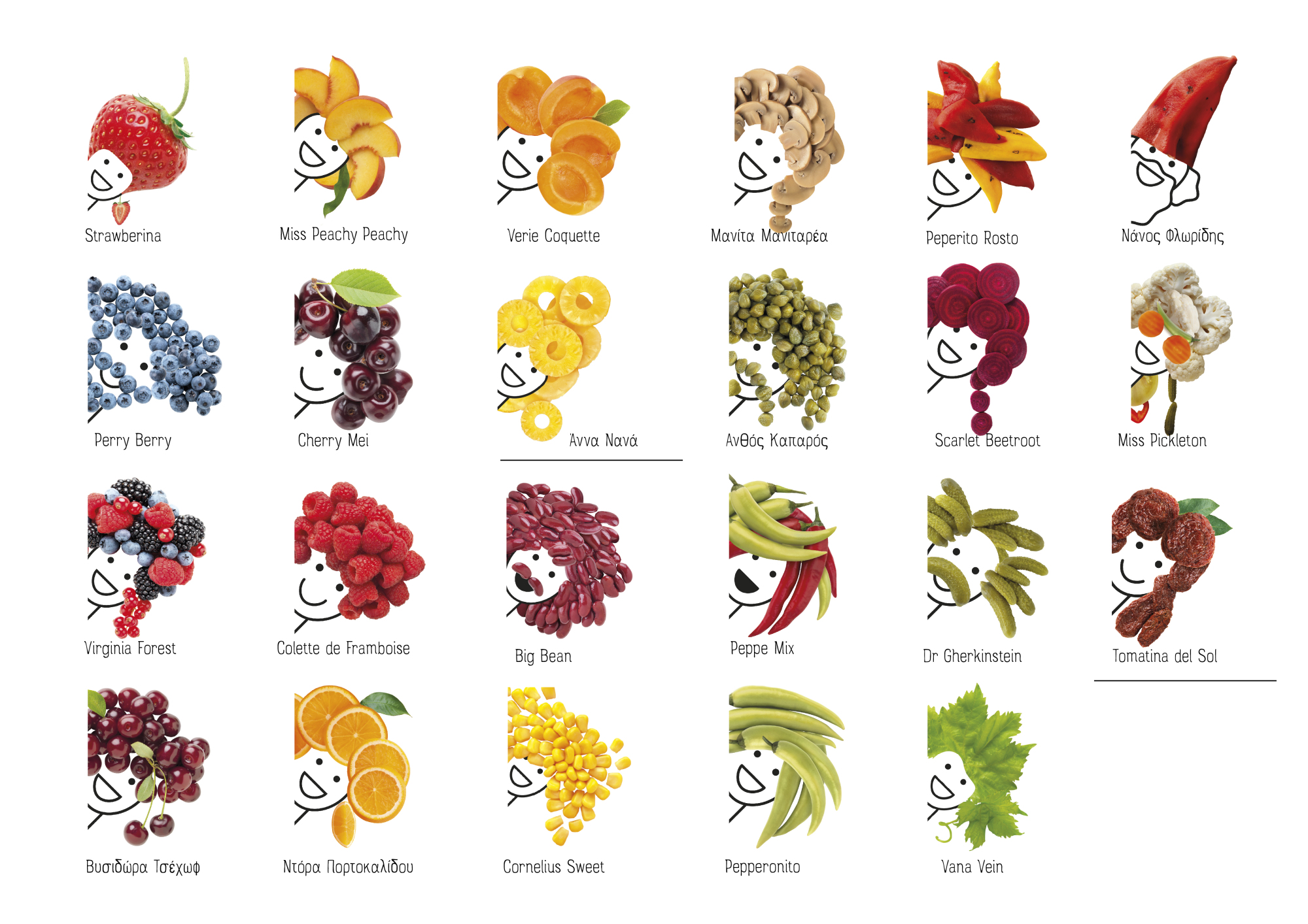
For every product we designed its producer's portrait. Each producer, is the person who really cares for his/her product to reach the best quality and taste. All portraits are designed with a minimal face and expression line art while they have a composition of real products instead of hair.
By the end of the project, we faced in front of us 45 faces smiling proud and happy for every single product they are producing.
Eδem packaging has been selected as one of the best packaging designs and is featured in the Best Package Designs publication. https://www.designrush.com/best-designs/packaging


.gif)


