

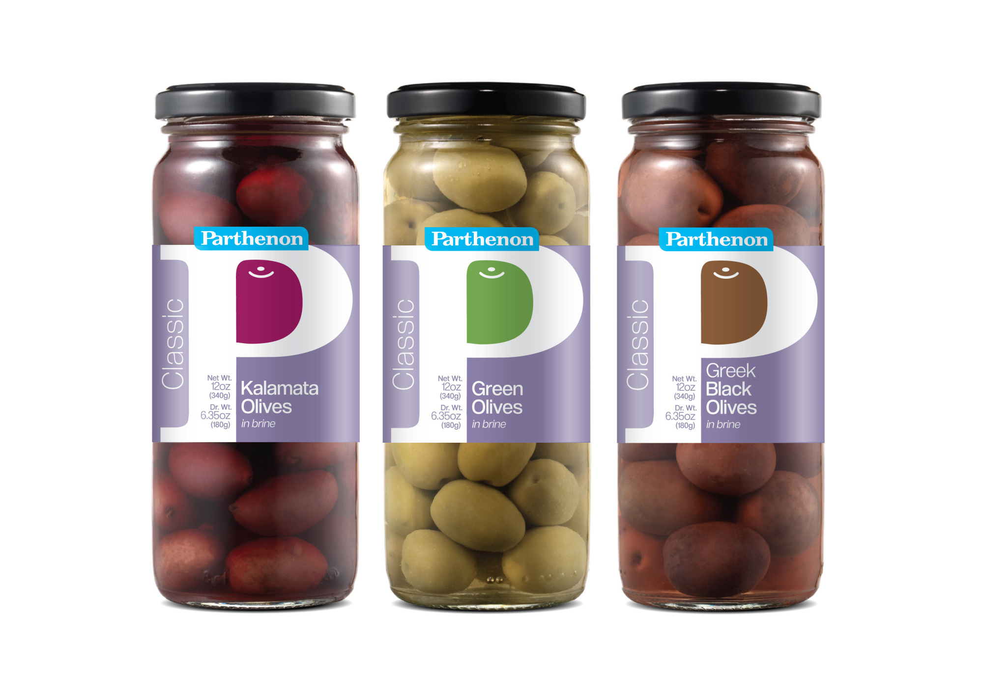
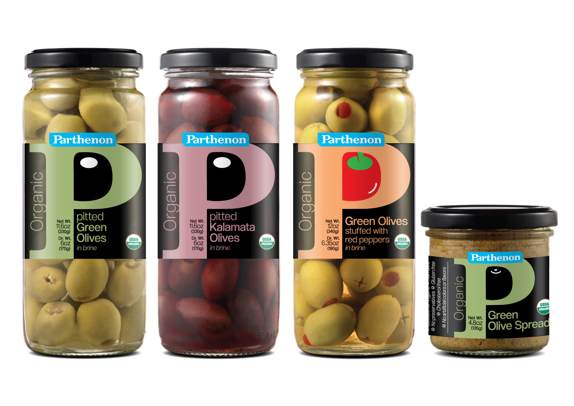
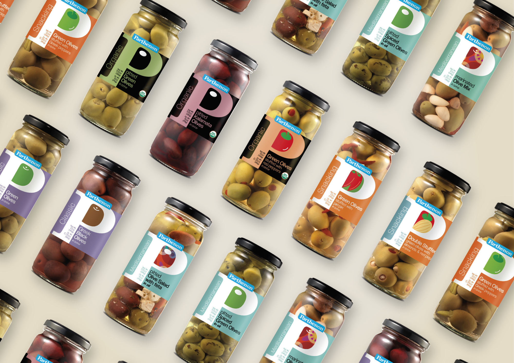
Parthenon - "P" Olive line
Branding of the retail series of olive products by the Parthenon company, primarily targeting the U.S. market. Our goal was to create a very strong and contemporary identity that would be unique, have a strong connection to the company, and stand out prominently on the shelf.
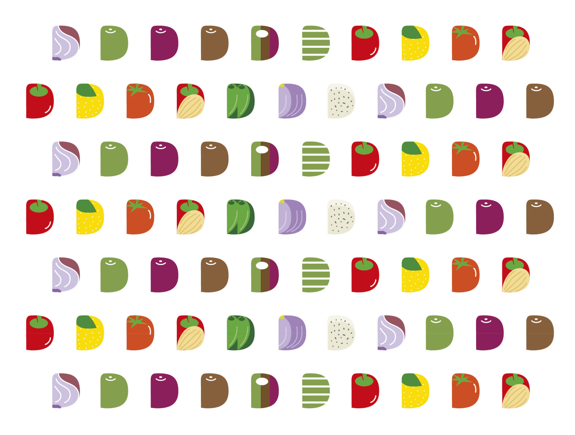
The letter "P" represents the initial letter of the brand "Parthenon." The eye of the letter "R" in the logo forms a shape reminiscent of an olive. Exploiting this shape, we designed elements that identify and differentiate each type of content. Thus, for whole olives, an olive shape was formed, and for stuffed olives with peppers, a pepper, and so on. What could be more characteristic than the birth of the "R" series? "P" stands for Parthenon!
With the "R" series, the company's products manage to distinguish themselves from the competition by using strong visual elements and paving a new path within their category.
Branding for the core retail series of olive products by the Parthenon company, for the U.S. market. With the "R" series, the company's products succeed in setting themselves apart from the competition by using powerful visual elements and forging a new path within their category.


.gif)


