


Pinky Mastiha Liqueur
Brand Concept
Pinky is not just another mastiha liqueur — it's a bold, modern twist on a centuries-old tradition. Inspired by the unique properties of mastiha resin from Chios and crafted with a spirit of playful confidence, Pinky redefines the category with an identity that is as distinctive as its flavor.
Design Approach
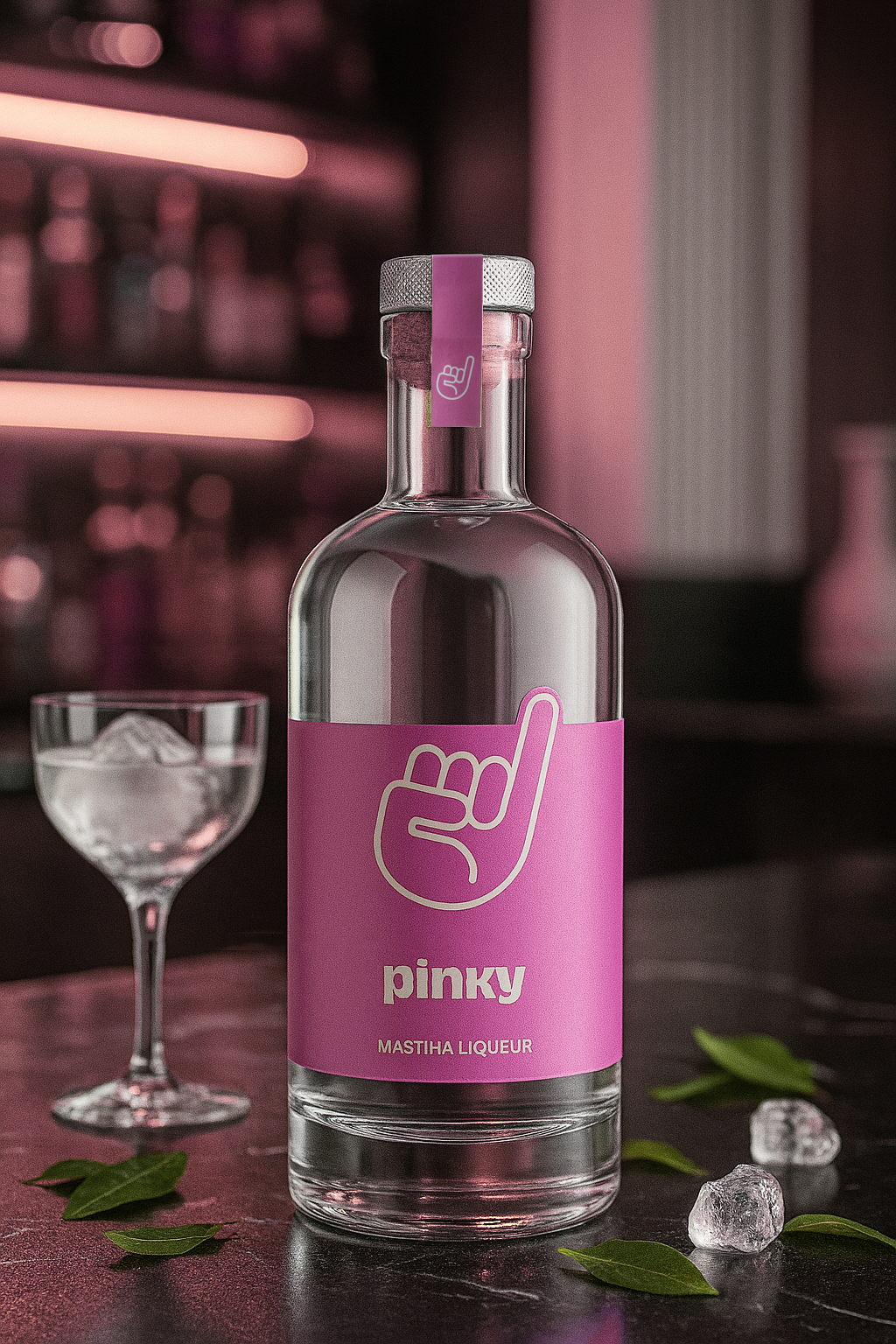
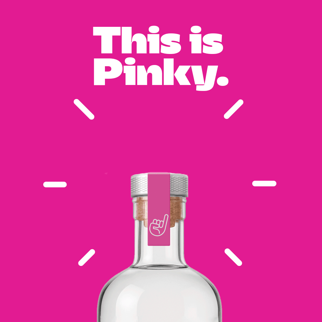
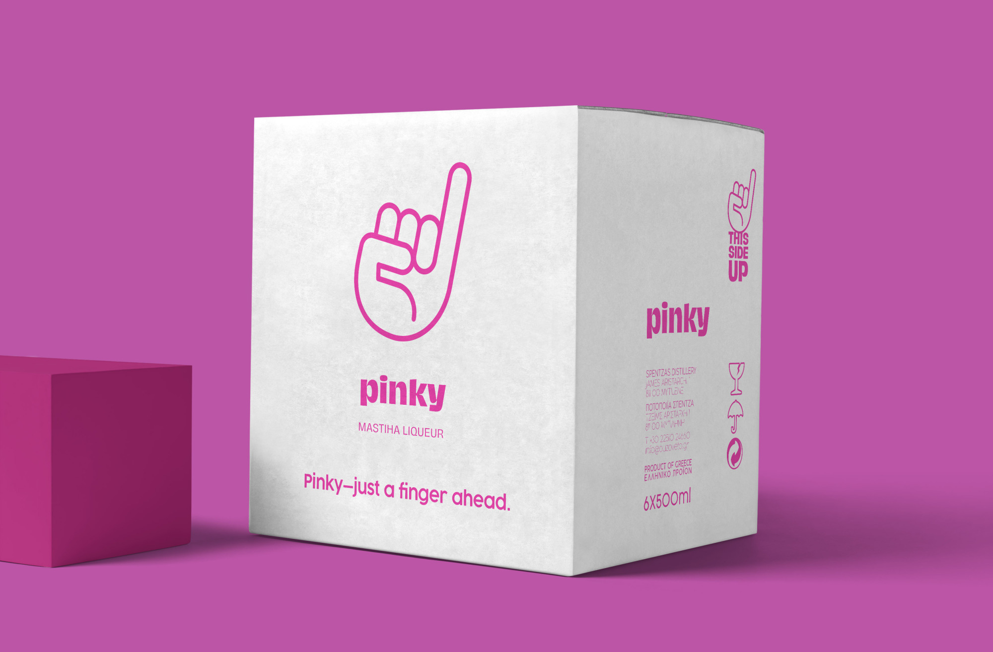
The design concept draws from the product’s name and attitude. The iconic hand gesture — a raised pinky — becomes the centerpiece of the visual identity, symbolizing both elegance and a cheeky sense of cool. The minimalist bottle design, featuring bold magenta tones and clean typography, stands out on the shelf with unapologetic clarity.
By combining a vibrant color palette with simple, geometric lines, the packaging aims to evoke a feeling of lightness, purity, and bold personality — qualities that mirror the refreshing taste of mastiha.
Logo & Symbolism
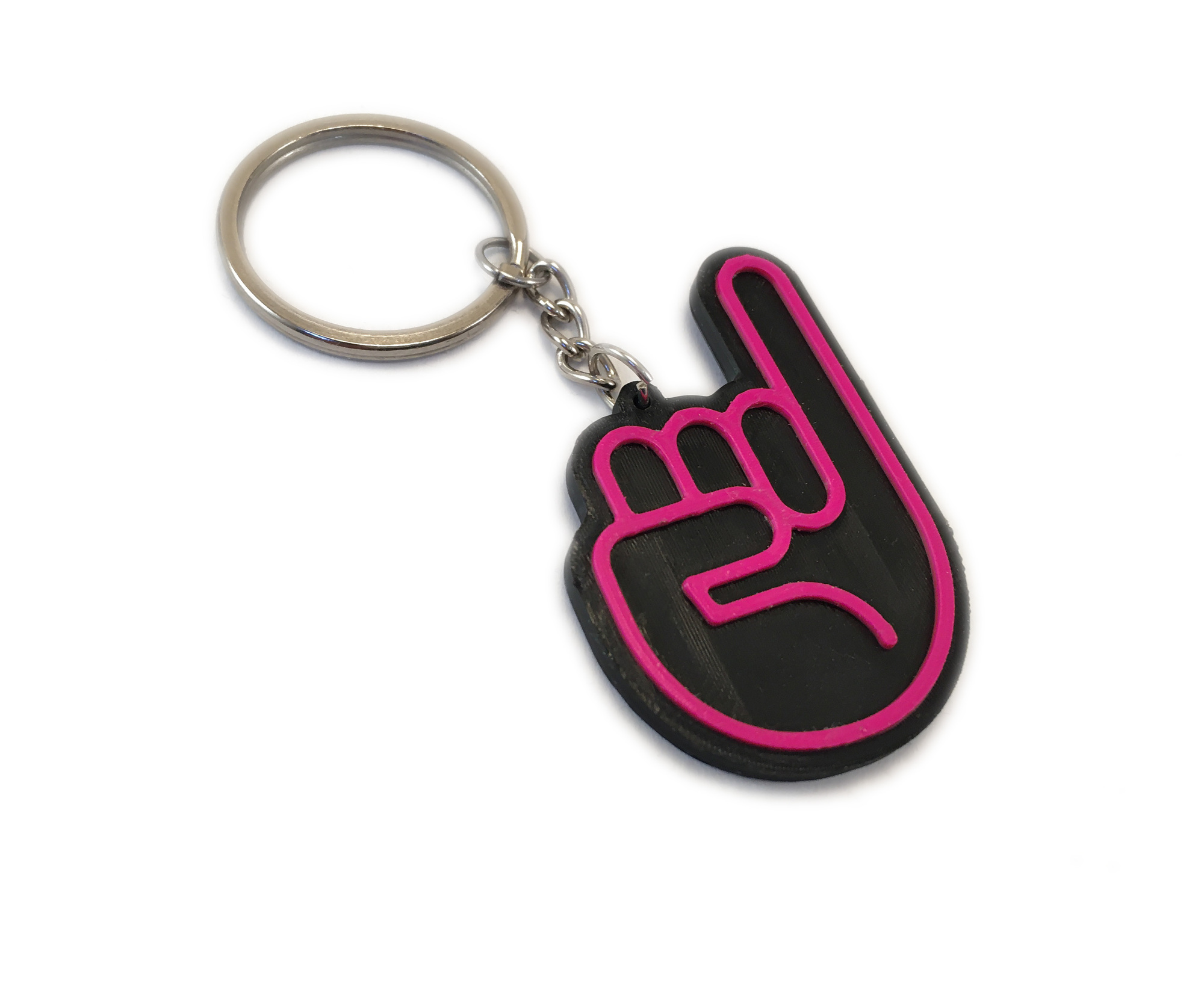
The hand icon is more than a logo — it’s a statement. It evokes the pinky swear, the subtle gesture of flair, and a nod to cultural confidence. The contour drawing style keeps it light and iconic, creating instant recognition across digital and physical applications.
Tone & Attitude
Pinky is designed for a new generation of consumers who appreciate authenticity but seek modernity. The tone is fresh, friendly, and slightly irreverent — never taking itself too seriously, yet always delivering a premium experience.
Visual Strategy
Photography and presentation use studio-like aesthetics with clean, saturated backgrounds to highlight the clarity of the bottle and the brightness of the brand. The product is framed in vibrant yet controlled compositions, allowing its unique color blocking and silhouette to take center stage.
Result
The result is a bold and elegant mastiha liqueur that looks as fresh as it tastes. Pinky brings together design, tradition, and personality — creating a product that sparks curiosity, conversation, and connection.


.gif)


